Lox & Key Gourmet Bagelry
Deliverables:
Brand Identity
Poster Design
Copy
Rendering
When embarking on this restaurant branding I made the decision to have three distinct brand personality goals: modern, fun and educational. Modernity was important as I felt like I wanted to bring in the clean and class deli-style, while still making it 'instagramable'. Using puns about bagels and prison kept the brand family-friendly and light-hearted. Eastern State Penitentiary is a fun place to visit, therefor Lox & Key should be a fun place to eat. Lastly, education was key to this brand’s success. All the terms used throughout are real prison terms, the sourced images are of Eastern State prisoners. If you are eating at Lox & Key, you should learn something new about Judaism or Eastern State.
The logo, as seen below, is a typographic logo chosen for its maturity and cleanliness. After searching for a fun gothic font, the ampersand stood out to me in Aliens and Cows, this becoming the logo-mark font. This typeface has a simple, classic feel that is timeless and relevant to the restaurant’s values. The lock symbol can be pulled out for smaller, more discreet marketing.
The secondary font, Biko, for the brand can be seen on the collateral packaging and promotional goods. The choice for this typeface to be all lowercase was to make the tone of the puns feel more casual and conversational, instead of yelling and or formal.


Resturant Mock-Up & Menu Boards

As seen on the left, customers call into the waitress through a prisoner visitation-style phone. There is a layer of glass between them, to make it feel like you are visiting a prison.
On the right, if you opt into take-out instead of a sit-down, your food is given to you through a one-way window, only allowing you to open your side when the inner glass has been shut.
Using a real mugshot from Eastern State Penitentiary, I converted the images into grayscale dot metrics images. These figures are comically large with disproportionate hands. See them as hanging interchangeable boards below.
Internal Branding to Promote Restaurant Opening
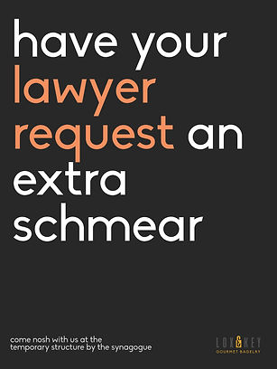
In order to attract new customers to the opening of the bagelry inside Eastern State Penitentiary, I created these promotional posters. I wanted to create simple, eye-catching visuals to pair with clever copy that I wrote. Using the same brand style as the collateral, I highlighted the word that you would associate with Eastern State Penitentiary and not food. When writing the copy I paired these jail words with Jewish puns, to mend both sides of the restaurant brand.


